before
• Difficult to understand what connected lighting is
• What are the product benefits and features?
• How clear are the categories in short dwell time?
• Lifestyle images are not representative of product benefits
after
• Using lifestyle images to enhance product benefits
• Including product icons to clearly communicate features
• Graphics to show differences between connected and switch control
• Introduction of Luminaires range to existing display
• Units can be modular to market requirements
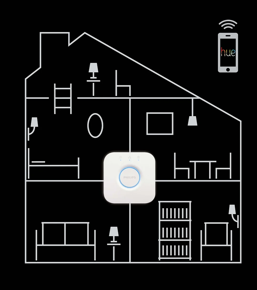
Illustration to show how the Philips Bridge device is at the heart of a connected home.
This was applied to retail displays and digital touch-points.
Introducing how to install the Hue lamp (step 2), helps demystify the myth that it’s a complex process, setting up.
Interactive screens with easy navigation of product portfolio and video demos was integral to the displays.


