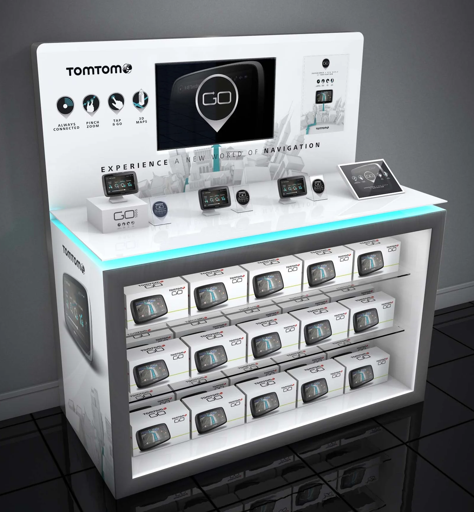
TomTom were launching a new 3D map navigation device that needed it’s own platform within their existing product portfolio.
Role: Concept, Art Direction, Design
After
By simplifying the retail shelf and being more single minded with products, it became more disruptive to customers.
Before
The cluttered retail reality and the less-sophisticated TomTom retail display.
Visual Language
A new design language system using the product’s features like the 3D maps was created and applied across multiple touchpoints. To celebrate the product launch in retail stores like Saturn and Media Markt, I developed a full print and retail campaign with clear navigation through the extensive product portfolio.
Dramatising the 3D Mapping feature
A 3D city was created to emphasise the new product feature.
3D renders by Dan Stern at Iris.


